Documentation Index
Fetch the complete documentation index at: https://www.autocoder.cc/docs/llms.txt
Use this file to discover all available pages before exploring further.
The First Problem Is Not Content. It Is Resistance.
A Familiar Moment
Emily Carter wants her son Leo to practice English. She opens a learning website. Leo looks at the screen and pulls back. Why? Not always because English is difficult. More often because English already feels like pressure before curiosity. For Leo, English has become something he expects to get wrong. Too many instructions make him nervous. Too much text makes him want to leave before he even begins. This is where many children’s products fail first:- Too much instruction too early
- Too many words before action
- Too much pressure before confidence
- Too little sense of “I can do this”

The Real Design Goal
So the first design task is not simply to teach. It is to make the child feel:- I can start quickly
- I know what to do
- This feels safe
- This will not be too hard
Product Logic: First Define What This Product Is, Then Show How It Works
More Than a Website
At first glance, this looks like a children’s English website. But that is not the best way to describe it. It is not mainly a brochure site. It is not mainly a content display page. It is a lightweight interactive learning app for kids. That difference matters. For Emily, this is exactly the point. She did not need another page that simply explained English to Leo. She needed a space that could pull him into action. A normal website explains. This product tries to move the child into action. Its role is not just to say, “Here is what we offer.” Its role is to say, “Pick one path. Start now. Finish one small task.” That is why it feels closer to a learning playground than an online worksheet system.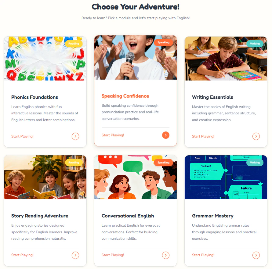
A Short Path by Design
The learning flow is deliberately short:- Enter the homepage
- Choose a module
- Complete one small task
- See progress and rewards
- Move naturally to the next step
- less setup
- less hesitation
- less pressure
- faster start
The Homepage and Visual Tone Make the First Step Easier
The Homepage Is Not Just Informational
The homepage is not trying to explain everything. It is trying to make one thing happen first: the child enters without resistance. That is why the page feels light instead of demanding.- The headline is clear and easy to read
- The navigation is simple
- The main actions are visible immediately
- The child does not need to decode the interface first
- The page feels easier to enter
- The first step is obvious
- Learning starts with curiosity, not pressure
Why the Overall Style Works for Kids
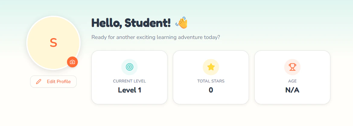
What works here is not just the look. It is the feeling of manageability. The product shows children where they are, what they can do next, and how learning is organized. Progress, modules, and actions are visible without making the page feel heavy.
- It softens emotional pressure
- It makes the next step easier to see
- It helps the product feel approachable
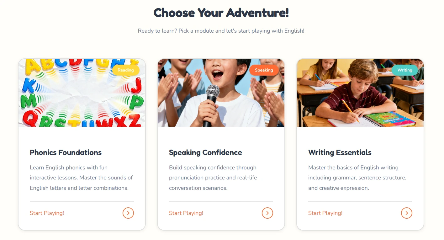
Three Core Modules, Three Different Learning Barriers
Speaking: Lowering the Fear of Starting
The Speaking module is built around one clear action.- one image
- one prompt
- one example
- one task to try

Writing: Making Expression Easier to Begin
Writing is often harder because the child faces a blank space. This page lowers that pressure by giving structure first.- the image gives context
- the prompt gives direction
- the sentence pattern gives support
- the tip reduces hesitation

Reading: Turning Reading into a Finishable Task
The Reading module keeps the task small and clear.- a short passage
- a supporting image
- one question at a time
- visible progress
Why This Product Feels Easier to Continue — and Why That Matters
Why Children Are More Likely to Keep Going
What keeps this product moving is not complexity. It is momentum. Children are more likely to continue when:- each task feels small
- the next step is obvious
- progress is visible
- effort is rewarded quickly
What This Product Really Solves
This is not just a case of putting English content online. What the product really redesigns is the learning experience itself:- easier to enter
- easier to understand
- easier to continue
Why AutoCoder.cc Is the Smart Choice for Building Children’s Learning Platforms
Key Takeaways:- Playful, Child-Friendly Design — AutoCoder.cc generates interactive, visually engaging websites that make learning feel like play rather than pressure.
- Fast Idea-to-Launch — Go from a product concept to a fully functional learning platform in minutes, not weeks.
- No Coding Required — Educators, parents, and product designers can build interactive learning experiences without technical expertise.
- Built for Engagement — Progress tracking, reward systems, and modular design keep children motivated and coming back.
- Complete Control — Deploy to your own domain, customize the experience, and maintain full ownership of your learning platform.
Related Topics: children’s English learning, kids learning platform design, interactive learning apps, child-friendly UX design, English learning for kids, educational product design, reduce learning resistance, AutoCoder website builder